Lab 6
Part 1
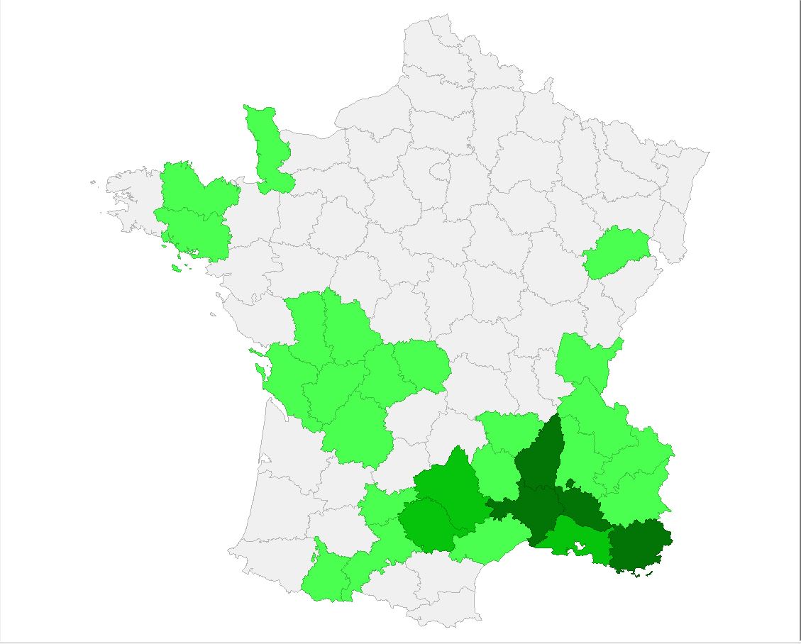
Significance Map
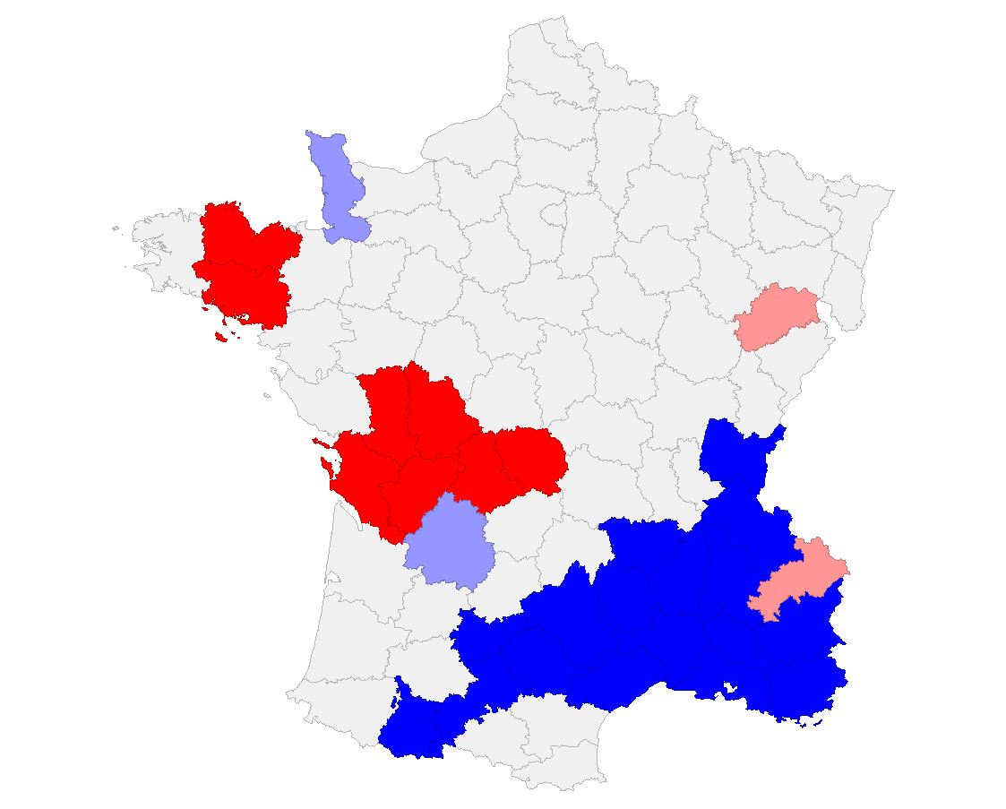
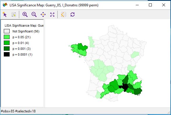
Cluster Map
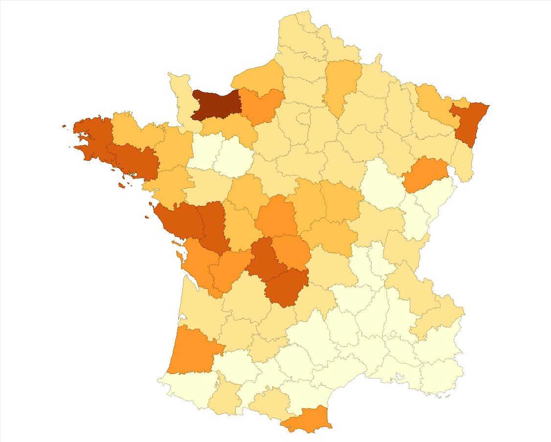
Natural Breaks Map
Significance Map with 999 Randomizations
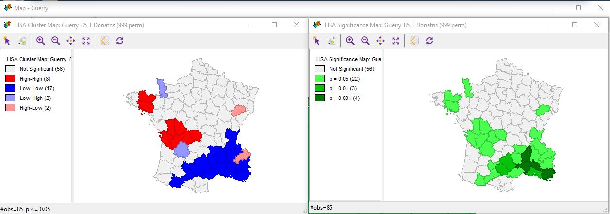
Significance Map with 99999 Randomizations
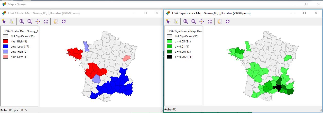
Cluster Map with 999 Randomizations
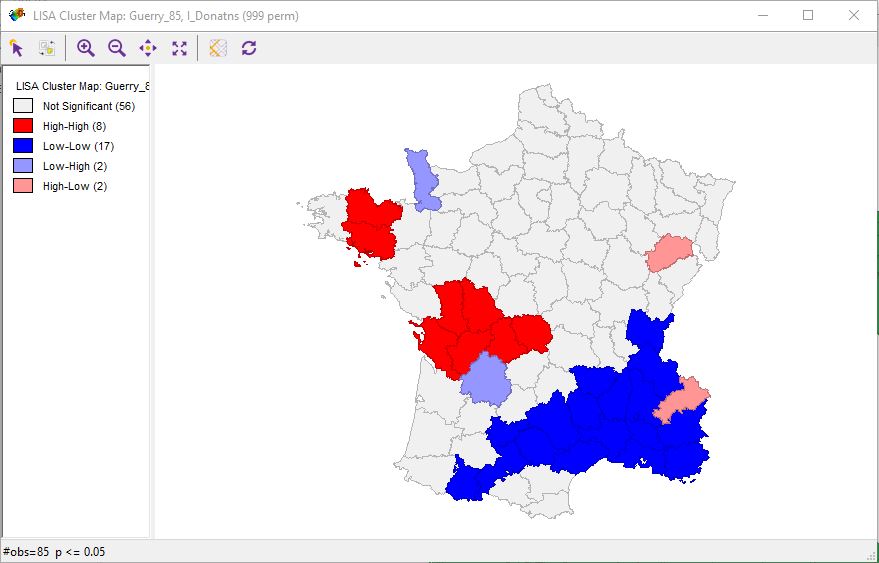
Cluster Map with 99999 Randomizations
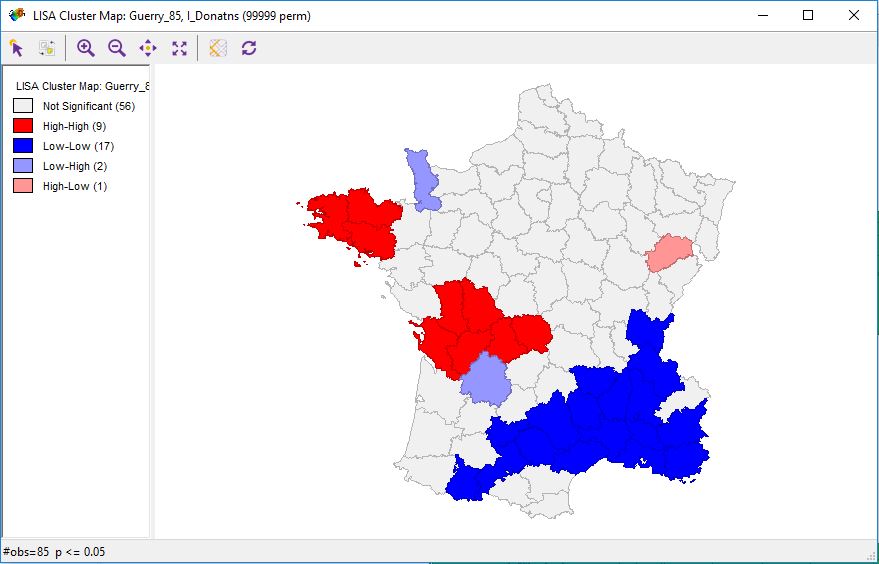
Selecting High-High Regions by Scatterplot Quadrant
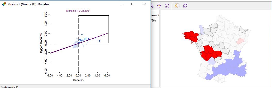
Selecting High-High Regions Manually
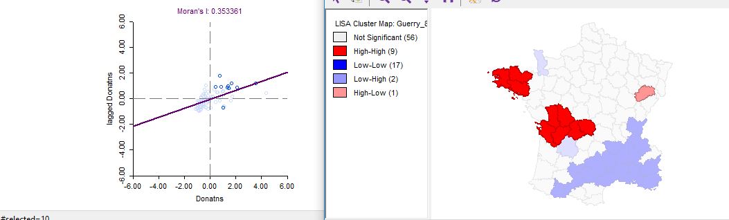
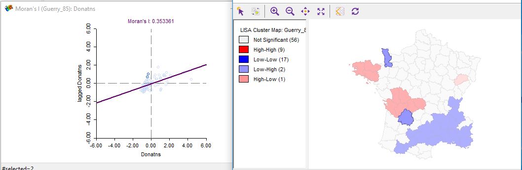
Selecting Low-High Regions from the Menu
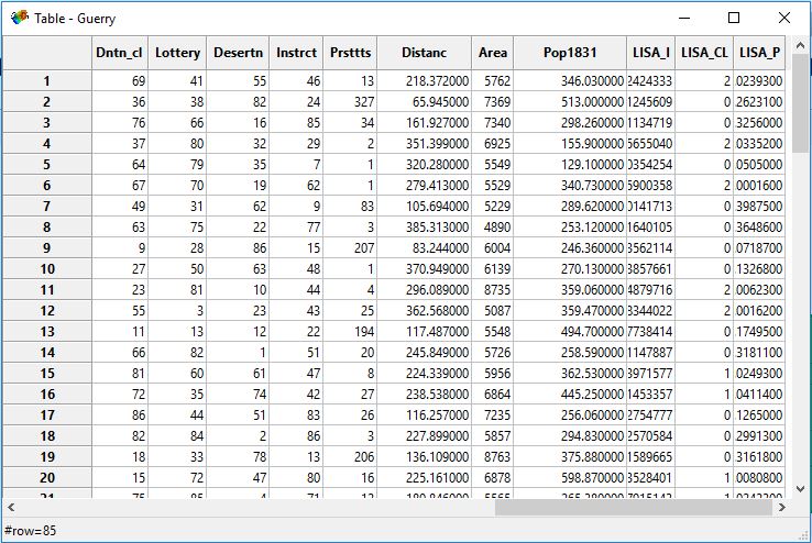
Adding LISA Stats to Table
Selection Using Significance Filter
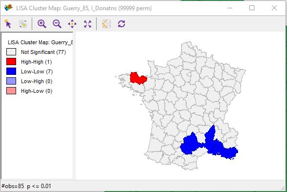
Highlighting Multiple Significance Factors
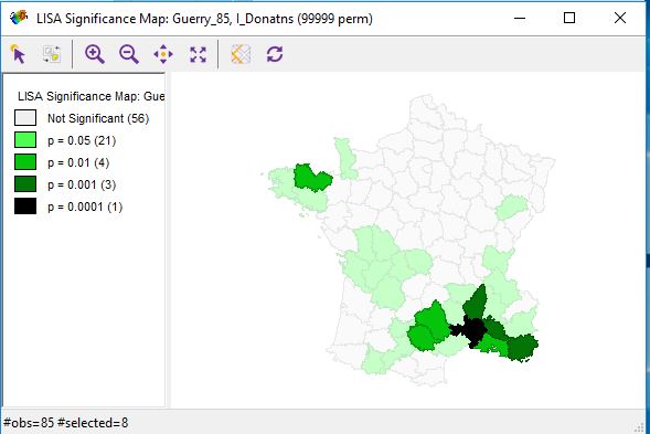
Selection Using Custom FDR Significance Filter
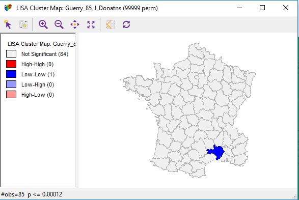
Selection Using Custom FDR Significance Filter
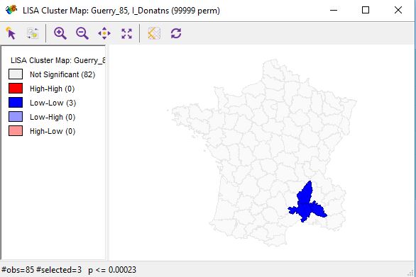
Displaying Cores and Neighbors
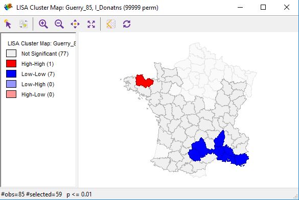
Overlaying Cores and Neighbors
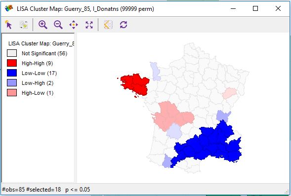
Selecting Significance from Cores and Neighbors
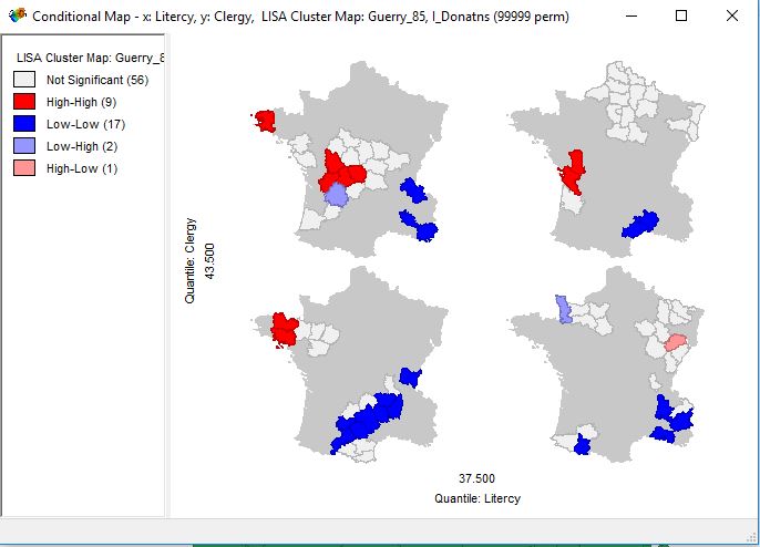
Conditional Cluster Map
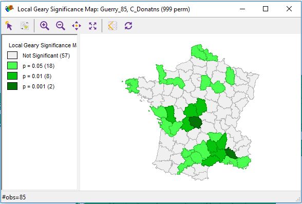
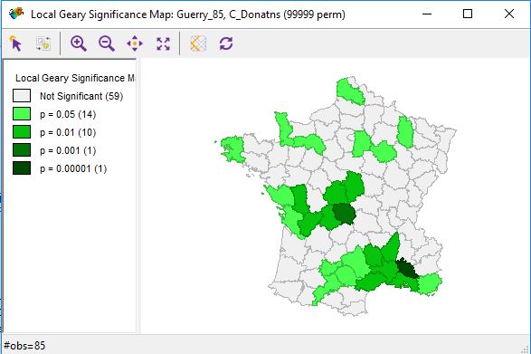
Greary Significance Map
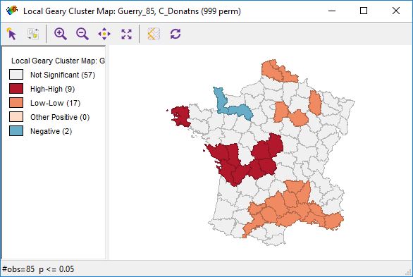
Greary Cluster Map
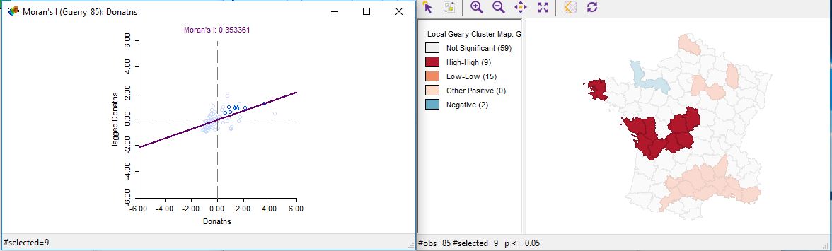
Selecting High-High Regions in Greary Scatterplot by Quadrant
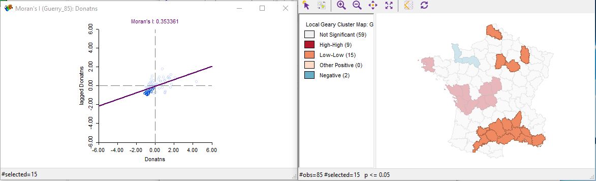
Selecting Low-Low Regions from Menu
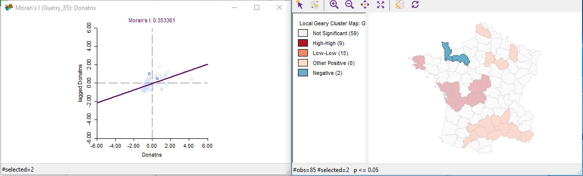
Selecting Negative Correlation Regions from Menu
Greary Significance Map (varies from Moran I)
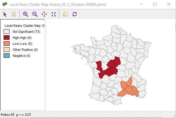
Greary Cluster Map with Significance of p = 0.1
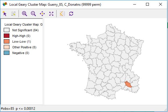
Greary Cluster Map with Custom Significance of p = 0.00012
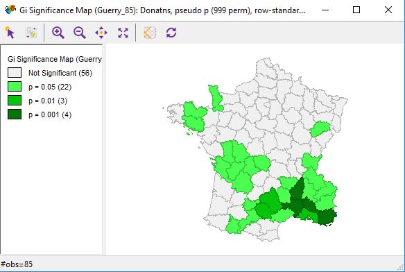
Gi Significance Map
Gi Cluster Map
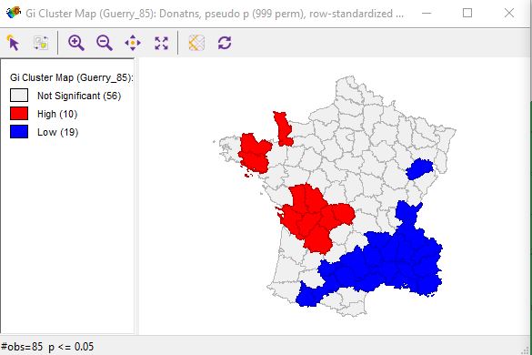
Gi Cluster Map with Significance of p = 0.1
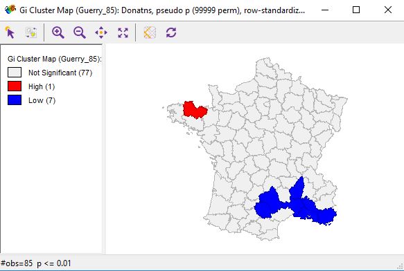
Greary Significance Map (varies from Moran I and Greary)
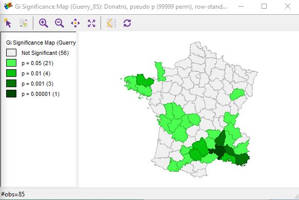
Gi Cluster Map with Custom FDR Significance
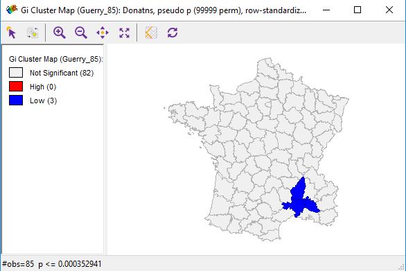
Part 2
For my part 2 analysis I ran a regression on the Baltimore City dataset to see if family size was correlated with poverty level.
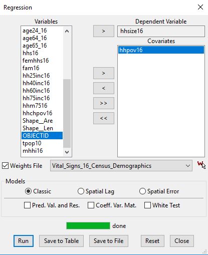
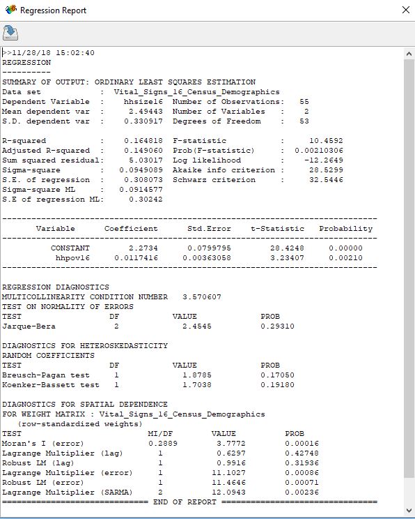
The regression report calculated a Moran’s I value of 0.00016, suggesting that the two were strongly correlated. I then examined the values for Lagrange Lag and error, which were as follows:
Lag = 0.42748
Error = 0.00086
These results would indicate that the error model results are extremely significant, thus it is a better fit.
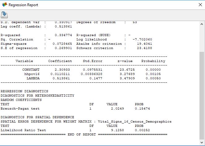
I then ran the error model, which yielded a probability of 0.00252, confirming my hypothesis of correlation.
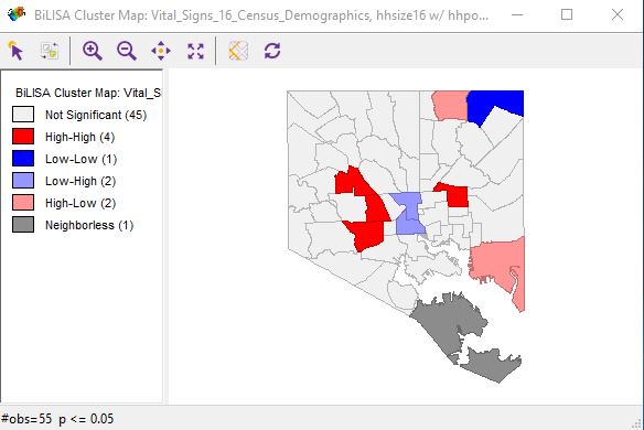
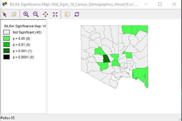
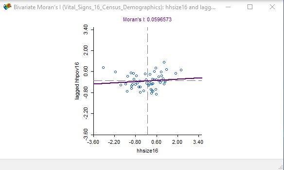
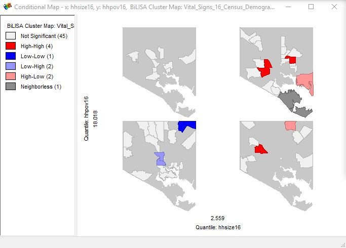
The resulting Bivariate Moran’s I Maps are displayed below.
Cluster Map
Significance Map
Scatterplot
Conditional Significance Map
Part 3